Dashboard & Insights
Your dashboard turns raw transactions into a clear picture of your money, this month's spend, your budget, category breakdowns, and AI-generated insights.
Understanding the dashboard
The dashboard is built around the month you're viewing.
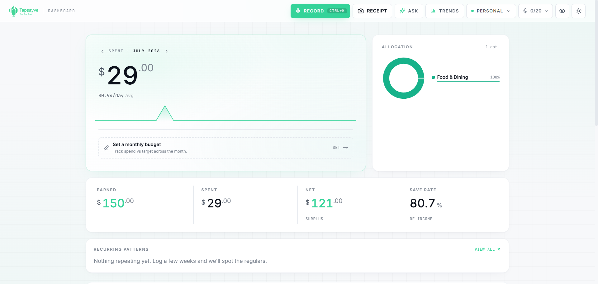
Web shows a summary hero at the top with:
- Spent this month: your total spending, with a change pill comparing it to last month (lower spend shows green).
- Daily burn & projection: your average per day and a projected month-end total.
- Budget bar: progress against your monthly budget, % used, days left, and a “stay on target” per-day figure.
- Allocation: a donut of spending by category with your top categories.
- Cash flow: Earned, Spent, Net, and Save Rate.
- Recurring patterns: items you've paid for more than once, auto-detected from your history.
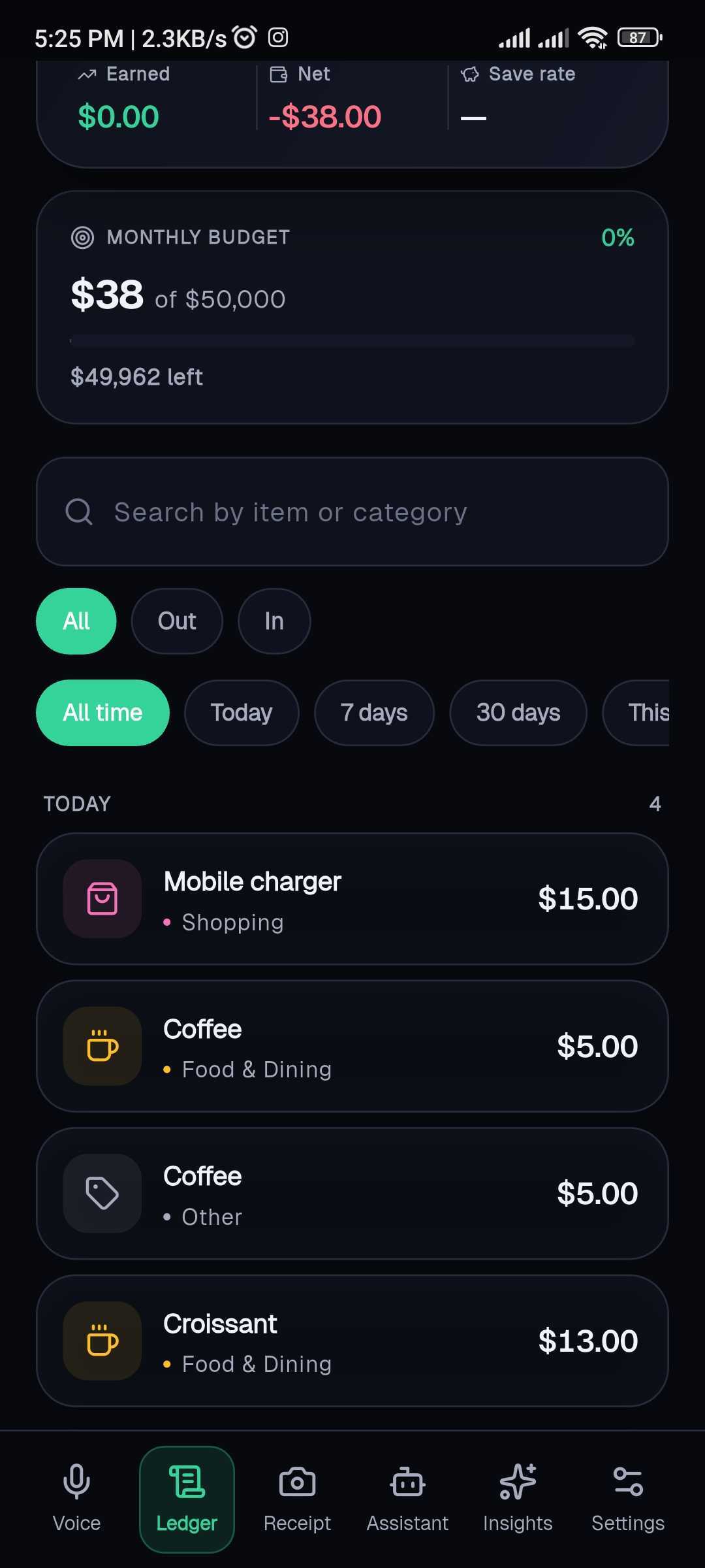
Mobile shows the same essentials on the Ledger tab: a “Spent this month” figure, a Net pill, Earned / Net / Save-rate tiles, your budget card, and the transaction list. The home (Voice) tab shows a “Today” total for quick daily logging.
Two date controls (and why they're separate)
The dashboard has two independent ways to change the date, and they do different jobs on purpose:
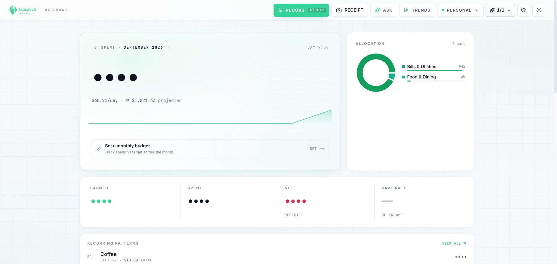
- The ‹ › arrows on the summary card change the whole month the summary is built from. They drive the “Spent this month” total, the budget bar, the projection, the category breakdown, and the cash-flow figures.
- The date filter on the search bar (below the summary) only narrows the transactions list, for example to review the last 7 days. It does not change the summary card.
So the summary card always reflects a full calendar month, while the date filter is just for finding and reviewing individual transactions.
Spending summaries
The numbers on your dashboard update instantly as you log. A few definitions:
- Spent counts expenses only, income never reduces it.
- Net = income − spending for the month (shown as a surplus or deficit).
- Save rate = net ÷ income, as a percentage.
- Budget % = spending ÷ your monthly budget.
Hidden amounts: on web you can tap the eye icon in the header to blur all amounts, handy in public or when screen-sharing. Tap again to reveal.
AI insights
Insights are short, AI-written observations about your spending, trends, unusual charges, recurring costs, savings opportunities, and forecasts. They're generated only when you ask, so they never run up costs in the background.
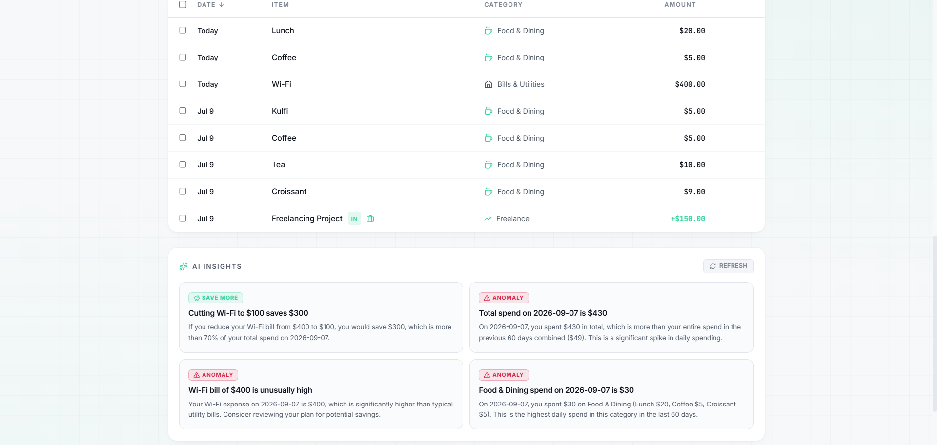
- 1Open the Insights section, the card at the bottom of the web dashboard, or the Insights tab on mobile.
- 2Select Generate (or Refresh / the regenerate icon to update them with your latest data).
- 3Read your insights. Dismiss any you don't want with the ✕, dismissed insights won't come back.
Ask the AI assistant
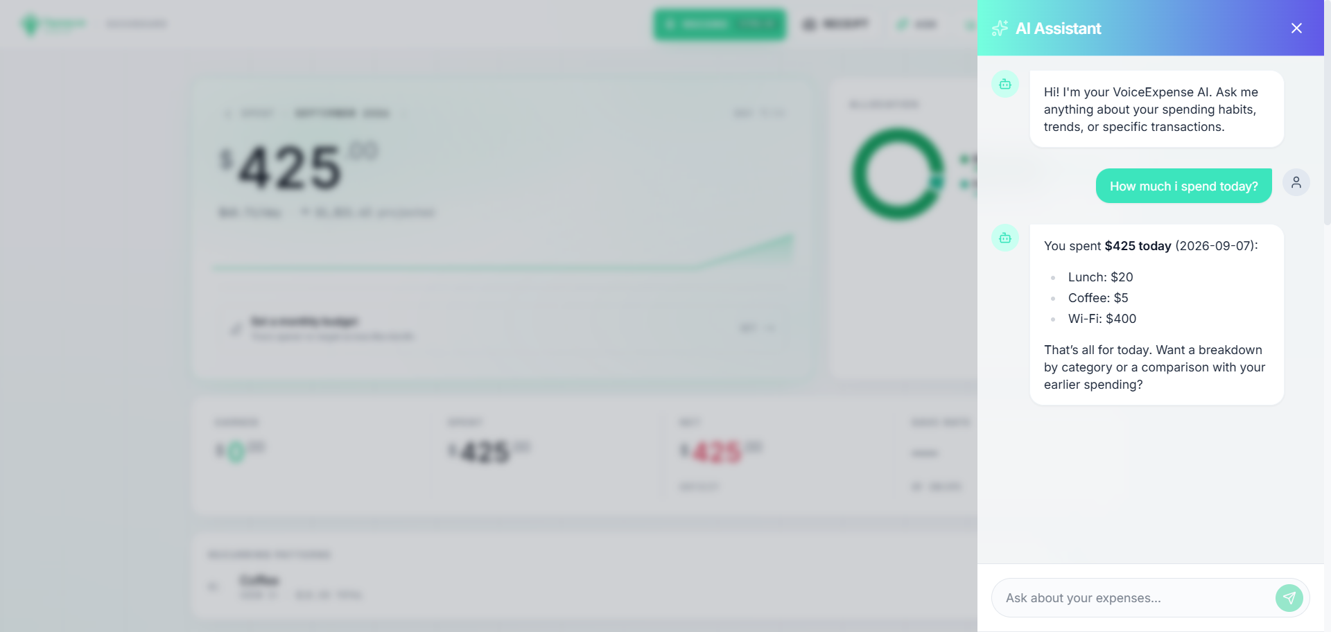
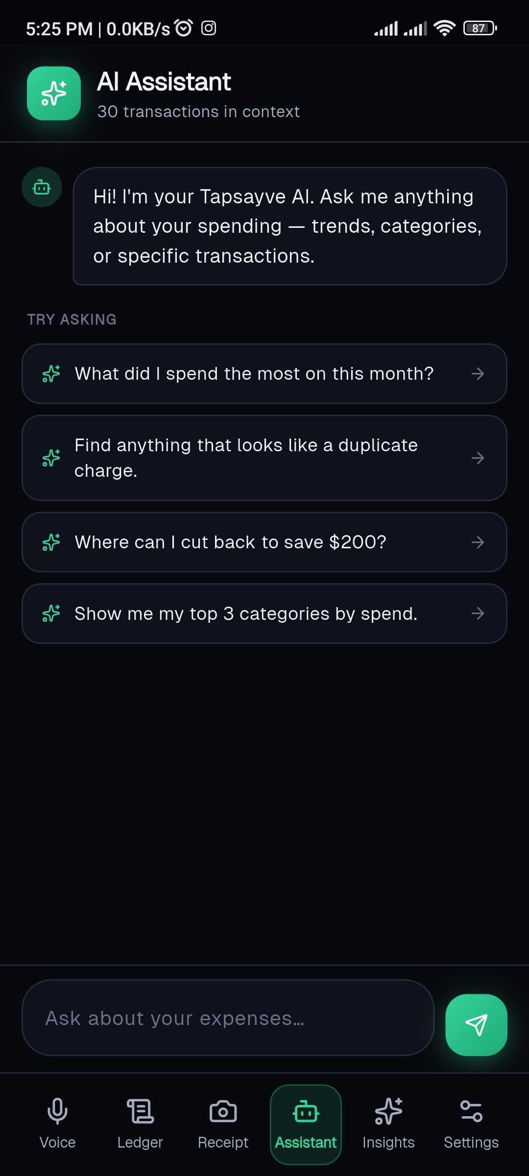
Beyond the generated insights, you can ask the AI assistant free-form questions about your spending in plain language, for example “how much did I spend on food this month?”, and get an instant answer. Open it from the Ask button (web header) or the Assistant tab (mobile).
Charts & trends
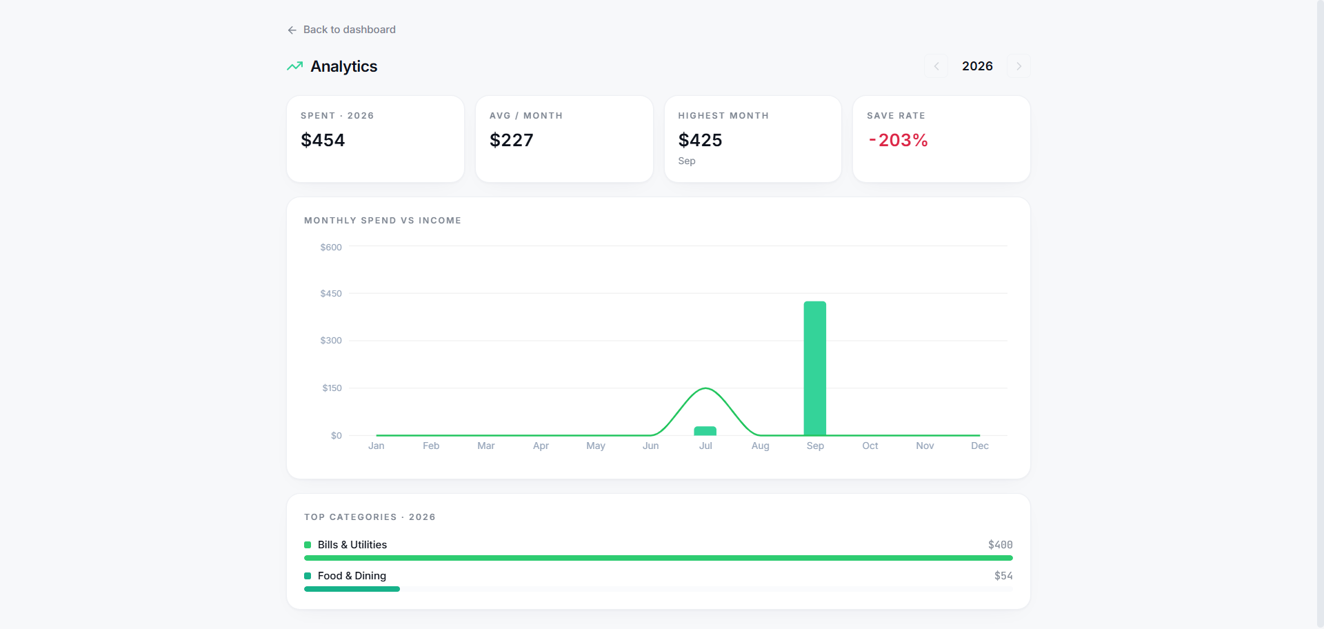
The web app includes a Trends screen (the Trends button in the header) for the bigger picture across a whole year:
- Yearly KPIs: total spent, average per month, your highest month, and save rate.
- Monthly spend vs income: a 12-month chart (bars for spend, a line for income).
- Top categories: your biggest categories for the year, ranked.
- Use ‹ Year › to compare against previous years.